
Reimagining the onboarding experience
A redesign focused on reducing early drop-offs, increasing onboarding completion, and guiding new users to complete at least one key action.
SaaS
B2B
Desktop/Mobile

Role
Lead Product designer
Timeline
3 months
My direct contribution
End-to-end design and delivery, Research, Stakeholder interviews
Team size
1 Designer, 2 engineers, 1 PM
When I joined Maji, the product was already live with an established customer base and a rich set of features. However, as the product evolved, the user experience had taken a back seat.
Most users who registered for Maji never completed the onboarding journey, leading to low activation and poor adoption of key features. Critical actions during onboarding such as linking financial accounts, booking a financial coaching session, and increasing pension contributions had very low engagement.
As a B2B platform, this directly impacted customer satisfaction. Employers were concerned that too few of their employees were actively using Maji.
Challenge
Rather than focusing only on the onboarding screens, I mapped the entire activation journey, from the product demo and the spaced activation reminders and first-time user experience.
This helped me identify several friction points before users even reached onboarding, revealing that the activation problem extended far beyond the onboarding flow itself.
Strategy
KPIs with targets to achieve
Completion Rate – 25%+ of users finish the onboarding flow within 10 minutes
User engagement – 80%+ of users take one action during onboarding - link atleast 1 account, financial health check, top up pension(specific personas only)
Conversion Rate – 5% book a financial coaching session
Scenario storyboard
When users receive the activation email, they have little understanding of what Maji is or how it can benefit them. They begin onboarding because their employer has invited them, but without clear context or value, many lose confidence and drop off partway through.

-
Made activation emails clearer and more scannable so users understand the offering and context better.
-
Added a QR code to the demo slides linking directly to registration, so users can onboard via their phone at the time of demo.
Changes made

User flow

Primary research
Before exploring solutions, I wanted to validate our assumptions by understanding existing users' perspectives. We sent out an email asking users if they would participate in a 45 min converstaion with the product team in exchange for a voucher and conducted 11 in-depth interviews with to uncover the motivations, pain points and frictions they faced during onboarding.
Personas
After synthesising the interview findings, two distinct user personas emerged. The research validated several of my initial assumptions many users struggled to understand Maji's value proposition and others were hesitant to engage due to concerns around the security and privacy of their financial data.

Behaviour
Lives paycheck to paycheck, focused on covering rent and student loan payments, going out, not actively thinking about saving or investing
Apps used
Monzo, Lloyds bank app

Behaviour
Plans ahead for long-term goals like vacations and retirement, holds one mortgage, contributes actively to a pension, and keeps track of investments manually rather than through an app. Consults advisors when needed.
Apps used
Tried Emma for budgeting, HSBC bank app
Stakeholder interviews
Interestingly, administrators reported receiving very few complaints about onboarding. They had limited visibility into where users were dropping off or why onboarding wasn't being completed. This highlighted a gap between reminder campaigns and understanding the underlying barriers to activation.
Secondary research
We analysed more than 30 Hotjar sessions recordings to understand real user behaviour, uncover where users dropped off, and identify usability issues throughout the onboarding journey.


Support tickets
A review of support tickets revealed recurring themes around account linking.
Users frequently reported that their bank wasn't listed, were unsure how to proceed when this happened, and lacked confirmation that their account had been successfully connected.
Design process
An iterative process was followed. Designs were regularly reviewed with the PM, Engineering, and internal team when required to validate assumptions early, reduce implementation risk, and ensure solutions addressed both user needs and business objectives.
IDEATE
UNDERSTAND
DESIGN
ITERATE
TEST
Initial wireframes
I started with rough sketches and sticky notes to prioritise ideas.

Competitors
I conducted a competitor analysis of financial platforms with similar offerings, including Emma, Moneybox, and Bippit, to understand established onboarding patterns and user expectations. While these products offered visually polished experiences, I also identified usability gaps and missed opportunities that we intentionally avoided replicating.


User flow
Design exploration
Designs that didn't make it to the final prototype



Usability testing
To validate our mobile and desktop designs, we tested with the internal team and friends, family who fit the user profile. The response was positive.
Timeline
1 week
Participants
12
Location

UK
Final designs
Welcome screen:
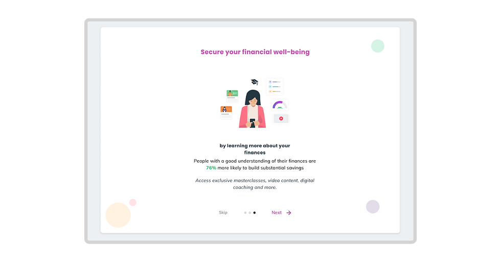
Redesigned the welcome screen to clearly communicate Maji's value proposition with a concise tagline and product visuals, helping users quickly understand what the platform offers before starting onboarding.
Screen 2:
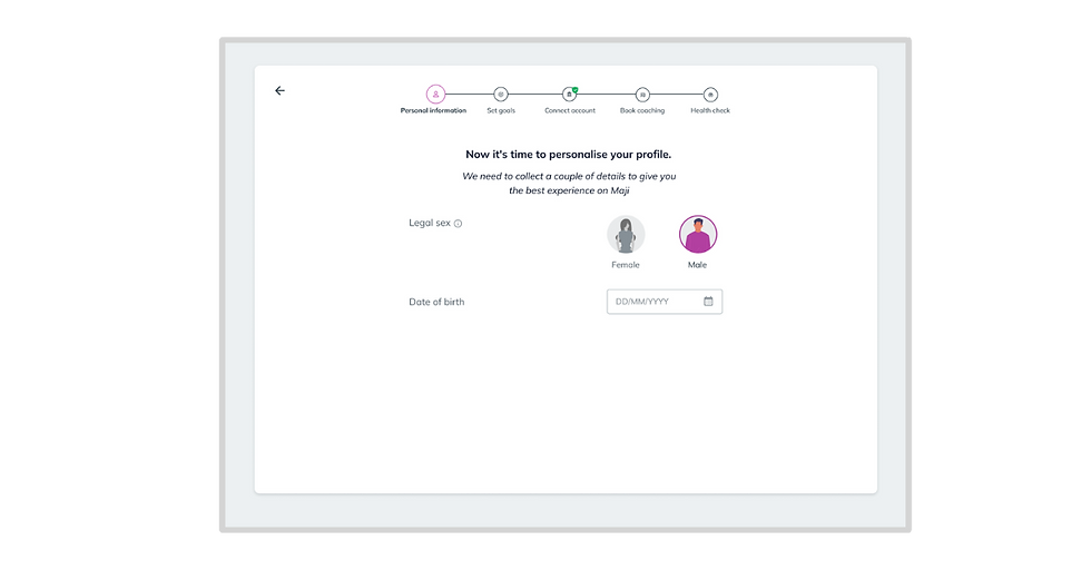
Applied the goal-gradient effect by displaying the first step in the progress indicator as already complete, creating an immediate sense of progress and increasing users' motivation to continue through the onboarding journey.
Added a contextual call-to-action (CTA) alongside the onboarding step, making the next required action clear and reducing uncertainty about how to progress.


Outcome
In the next 3 months
-
8% users completed onboarding
Completion rate
Median time to complete onboarding
-
3-5 minutes
-
100% users who completed onboarding added atleast 1 bank account.
Engagement rate
-
4 users signed up for coaching while onboarding
Coaching booking
Future scope
-
AI-guided onboarding: Introduce an AI assistant to provide contextual guidance and answer financial questions making onboarding feel more personalised and less intimidating.
-
Coach introduction videos: Allow users to watch a short introductory video from their financial coach before booking, helping build trust, set expectations, and increase coaching uptake.
Next project

Defining an MVP for financial literacy
Exploring how Maji could expand beyond financial wellbeing tools by introducing a scalable financial education experience.
