
Designing a smarter upgrade journey to increase Maji Master Conversions
How might we help users recognize the value of Maji Master and motivate them to upgrade when it provides meaningful benefits for their financial wellbeing?
SaaS
B2B
Desktop
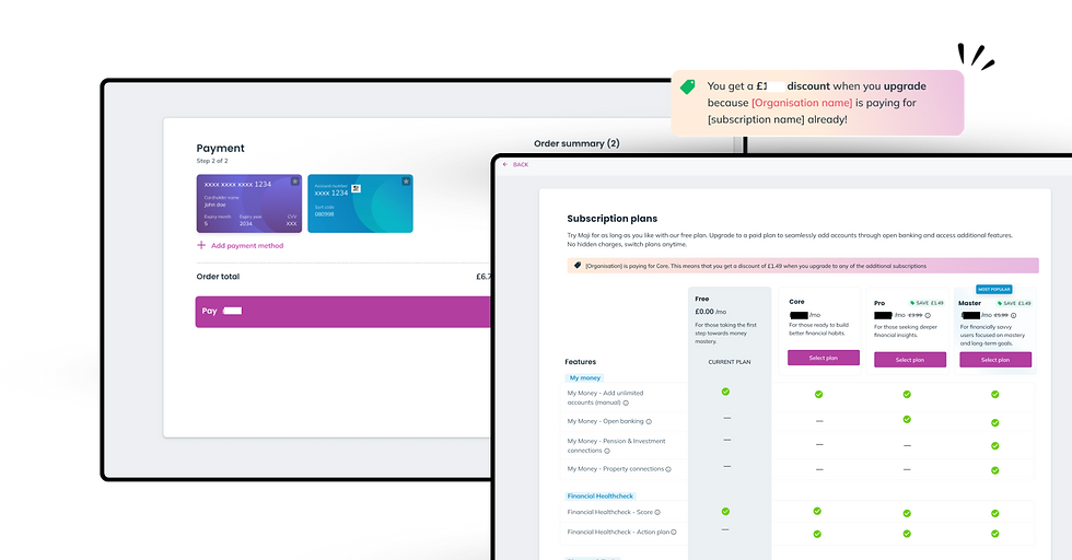
Role
Lead Product designer
Timeline
3.5 months
My direct contribution
End-to-end design and delivery, Research, Ideation
Team size
1 Designer, 3 engineers, 1 PM, Founder
Maji offered a free, core, pro and a premium subscription (Master), but very few users were upgrading.
The problem wasn't simply a low conversion rate. Analytics revealed that most users never even visited the upgrade page, suggesting the issue occurred much earlier in the journey.
Without users even considering the upgrade, optimising the checkout flow or pricing would have little impact. The opportunity was to redesign the experience so users could naturally discover, understand, and desire the additional value offered by Master.
Challenge
Before conducting user research, I wanted to understand whether the problem was truly a user behaviour issue or whether the product itself was creating unnecessary friction.
I began with a product audit, mapping the end-to-end upgrade journey from the perspective of a Core user. Several gaps became apparent. The upgrade experience wasn't just one screem, it was a collection of disconnected decisions spread across the product.
Strategy
Goal
Encourage more Core users to discover, understand, and upgrade to Pro/Master.
-
5% increase in Core → Master conversion within one quarter
-
15% annual increase in upgrade conversions
-
Higher discovery of premium features throughout the product
-
Increased engagement with upgrade touchpoints
-
Improved understanding of the value difference between Core and Master
Key product hypothesis
After reviewing the existing experience, several potential issues emerged.
The audit suggested the challenge wasn't simply poor conversion, it was a lack of visibility and perceived value. Most users never reached the upgrade page, meaning the problem existed far before this. Before asking users why they weren't upgrading, we needed to address the obvious product gaps and validate which assumptions were having the greatest impact.

-
The unique benefits of Master/Pro were hidden behind a paywall without context
-
Users understand what problems Master solved that Core couldn't
-
Users cant easily discover that Pro/Master existed
-
Premium features are not visible throughout the journey, only on the dedicated pricing page
-
Not enough opportunities to learn about Pro/Master naturally
-
No upgrade prompts shown when users were most likely to see their value
Existing user flow

Employers typically purchase the Core plan, with optional add-ons such as pensions and other employee benefits. Employees can then choose to upgrade to Pro/Master at any time for access to additional premium features.
Opportunity mapping
Scenario: Jane has been using Maji's Core plan for just a week now. She's trying to better manage her monthly spending and decides to explore Maji's tools that can help her. Lets look at the journay map with the existing flow and find opportunities.
Thinking
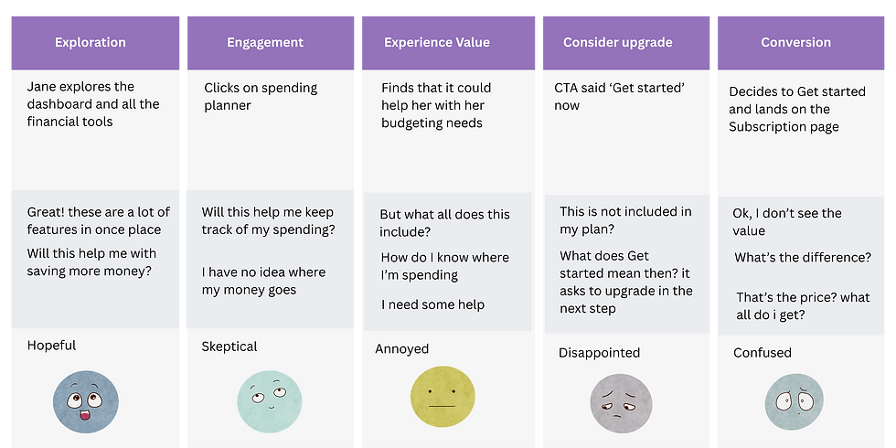

Doing
Feeling
Opportunities
Dashboard redesign
Although the primary focus of this project was increasing upgrades, I was also leading a parallel dashboard redesign. This allowed me to embed upgrade opportunities directly into the new dashboard rather than treating the upgrade page as a standalone experience.
A full dashboard redesign wasn't feasible due to limited engineering capacity and competing client priorities. Instead, we focused on targeted improvements that surfaced key financial features and introduced contextual entry points to upgrade within the existing dashboard.

New dashboard
Old dashboard
Design dependency
During the project, we identified that the existing empty states significantly impacted the upgrade journey. Many users encountered blank or inactive areas of the product with little guidance on what to do next, making them ideal moments to introduce contextual recommendations and premium features.
As a result, we expanded the scope to redesign the empty states alongside the upgrade experience. This extended the project timeline by two weeks

Existing empty state design
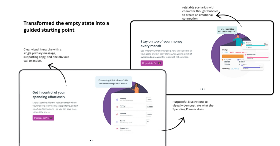
I redesigned the empty states across other key financial tools using the same design language, interaction patterns, and visual hierarchy. The opportunity was to surface their value throughout the journey so users could naturally recognise why upgrading was worthwhile.
High-impact, low-effort enhancements
Identified a series of lightweight improvements that could be implemented quickly without major engineering effort.

Ideating the subscription page

Before exploring solutions, I studied subscription experiences across popular SaaS products to understand how they communicate premium value and encourage upgrades.
Rather than reinventing the experience, I looked for established interaction patterns that users were already familiar with.
Key patterns that emerged:
-
Side-by-side plan comparisons
-
Recommended plan badges
-
Feature-first communication
-
Clear pricing hierarchy
-
Simple, focused layouts
Low fidelity wireframes

1. Subscription page
2. Review payment /Apply coupon
3. Pay
Rather than relying on the upgrade page to do all the heavy lifting, the redesigned journey gradually built awareness and interest.
As a result, the upgrade page became the final step in the decision-making process instead of the starting point.
1. Subscr

Subscription-payment user flow
Final designs


Outcome
-
+1.8% achieved (Quarterly)
Upgrades
Engagement with upgrade touchpoints
-
CTR 84%
-
Not yet collected this data
Annual upgrade conversions
-
+42% users visited
Visits to the subscription page
Next project

Reimagining the onboarding experience
A redesign that increased completion from 0% to 8%, increased account linking by 100%, and led 4 users to book their first coaching session.
